
1. Park Bench - Steven Juba Park, 1/50 f/5.6 ISO 200 60mm

2. Window Grill - The Exchange District, 1/25 f/3.3 ISO 200 60mm

3. Confederation Building - Main Street, 1/40 f/11 ISO 400 48mm

4. Surf - Alley behind Pantages Theatre, 1/20 f/5.6 ISO 200 26mm
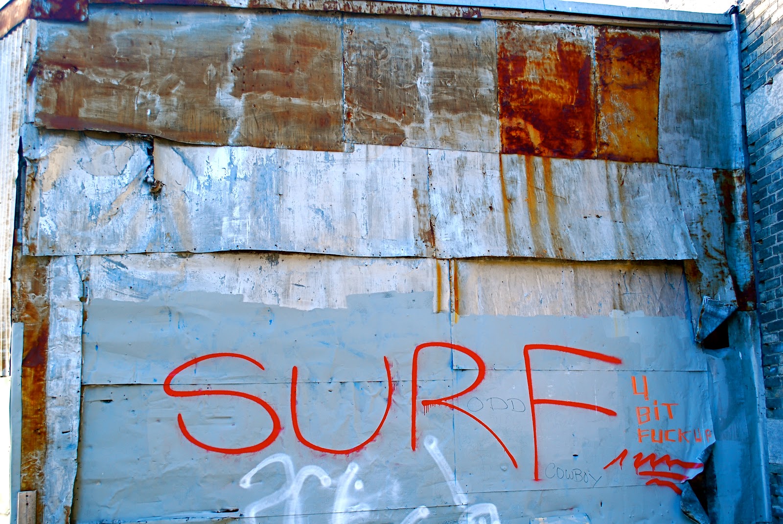
with edits

5. Window Grill 2 - The Exchange District, 1/15 f/8 ISO 200 60mm

6. Corrugated Metal - Pantages Playhouse Theatre, 1/20 f/8 ISO 400 60mm

7. My Runners, 1/100 f/4 ISO 200 60mm

8. Bike Stand - The Exchange District, 1/1600 f/3.3 ISO 200 60mm

9. Pickles - The Peasant Cookery Window, 1/1000 f/3.3 200 60mm

10. Run for the Cure bra display - Main Street, 1/4000 f/3.2 ISO 200 60mm
By far the standout for me is #3. The colours are amazing . . . bright blue sky against the orange glow the top portion of the building has taken from the setting sun. Great timing - this picture would not have been as impressive without such great lighting. Love it.
ReplyDeleteI also really like #6 and #10. #6 is so mysterious - had no idea what I was looking at, but love the colour and pattern receding into the background. #10 has great colour and contrast - and great line, with the wire, bras, and the building all parallel.
#9 with the pickles is probably my least favourite. I think it's the bright reflections off each jar plus you can see the dirty window at the right side of the picture.
#7 is weird. Couldn't tell what it was, and then even when I read the caption, I still can't make out how it's a runner I'm looking at. Sometimes I think the use of a large aperture to blur just about everything in a photo except a very narrow band can be very effective - basically forcing you to focus on the thing of interest to the photographer. And I guess that's the effect you were going for here - to force us to focus on the pattern in your runner. But sometimes I find the effect somehow irritating. That's what I felt about this photo - it irritates me. I can't tell what I'm looking at, but it's not like #6 where I like it. It bugs me for some reason with this photo.
#2 and #5 are cool. I like the peeling paint flakes and rust underneath, pushing its way through to the surface.
But yeah, #3 is where it's at. Lovely, lovely photo.
It wasn't my intention for you to be able to figure out what picture 7 was. I wanted it to be abstract. What I like about the photo (which is why I posted it) is that there are a few vertical lines that are hazy...light, dark, colour...which adds to the repetition of the more obvious repetition in the in focus pattern.
DeleteI also don't find criticism like "irritating" very helpful. I can appreciate that you don't like the photo but suggesting how you would change it would be more helpful to me.
Just giving my personal reaction to the photo. That doesn't mean it's not a good photo. I struggle to find the right words sometimes. Maybe frustrating would have been more appropriate. I was frustrated that I couldn't figure out what I was looking at, even after being told it's a runner. That doesn't mean you should change anything - it's just my emotional response to the photo. I guess I need to expand my horizons to allow for the abstract in photograpy and not have to be able to figure out exactly what I'm looking at, especially where the assignment is something like pattern/repetition. Some abstract art irritates (sorry, frustrates) me too. ;-)
DeleteThis comment has been removed by the author.
ReplyDelete#5 and #2 are very lovely. I like them because they are simple. The colors are beautiful and earthy with the rust.
DeleteMike is right about #3. It's a stunning photograph. Timing is everything here with the sunset. I love it too.
#4 is very neat. I like the red in the 'surf' against the blue. The rust pops out a lot more with the edits. The photo colors are richer in the edits, which I like.
#6 Is a neat photo. I love the color and the simple lines.
#7 LOL at Mike!!!! That's just weird, man. Corina, I think it's neat!
#8 I like the way you used the wire and the building to frame the row of bras. It's a whimsical photo. Very vibrant and fun to look at. :)
for some reason this posted twice.
DeleteOnce again it's unanimous. #3 is very well done. I agree with Lisa the timing was spot on you captured the colours of the sun set beautifully. You can even see the sun set colours reflected in the clouds.
ReplyDelete#9 is also sucessfull. I even like the fact you can see the window it adds another layer.
Keep up the good work!